Scarfest Website Production - Build
- Summer Ezehi

- Oct 14, 2024
- 3 min read
Updated: Oct 18, 2024
Build Portfolio PowerPoint
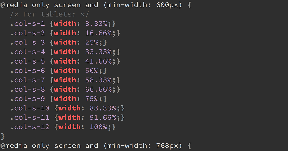
Firstly, we used W3schools to understand how responsive CSS works. Responsive CSS is when the website changes size depending on the device used. We copied the code from W3schools and pasted it into the style.css file.

Using the research from the pre-production plan I selected the google fonts I wanted to use for my website and pasted them into my index file. I also linked the stylesheet and the fonts I will be using.

Although I have coding experience while making my website, I used W3schools to help me code certain things. I did run into issues with my code mostly because of forgotten closing tags or putting the wrong value in CSS but I used W3schools to understand where I went wrong by looking at their code.
What went well in my website building was that it was easy to make because I had a clear layout for my website because of the mockup design I made. I also think having previous knowledge of html, CSS and JavaScript allowed me to code my website faster because I have experience.
Even though I have experience I do not know everything, so I did run into some issues like formatting paragraphs and text since they would not line up the way I wanted them to, but I used W3schools, and my issue was fixed. Another issue I ran into was forgetting I gave the same class to 2 different buttons so when I would add CSS to the button it would completely change the website.
A big issue I ran into was when my website was put into phone ratio there would be massive gaps between the rows. I couldn't figure out what was wrong with it because when I put it into tablet or pc ratio it would look completely fine.


After lots of trial and error I found out it was a column by inspecting my website. I couldn't resolve the issue fully, but I made the gap less noticeable.

My inspiration for the homepage was Creamfields so I wanted an image or a video with text displayed over it. Finding a high-quality image was difficult but after finally finding one I pasted it into the code and tried adding text. However, I had issues with my text, so I used W3schools to find out where I went wrong.


To create the background, I used throughout the website i used https://cssgradient.io/ to create the gradient. I used the colours I picked out from design planning and then did some trial and error to see which one had the best balance for the website.

I used many techniques building my website like transition in CSS so when a button or link is hovered it has a smooth transition from each colour. Even though that is a slight change it adds to the aesthetics of the website.
Comparison between finished website and mock up design


I tried following the mockup design to the best of my abilities because it was the idea I was most sold on for a music festival website and it was simple yet effective. I did add things to the website that are not on the mockup like the date and place for the event as it gives people information as soon as they open the page.


When making the line up page I did originally make the mockup design but as time went on, I realised it would be easier to understand if one row was one day instead of 3 days in one row. So, I changed it to that, and it is easier to read and changes ratio well on other devices. Even though I did change the actual design of the lineup I did keep having an image at the top with text displayed over it because it grabs attention and is better than having a basic header with no images on the page.
My main goal for my website was to have eye-catching colours but also tell the user information about the event and highlight the event's photos in places other than the gallery.
Comments