Citrus Charge Original Concept
- Summer Ezehi

- May 12, 2025
- 2 min read
Updated: Jun 6, 2025
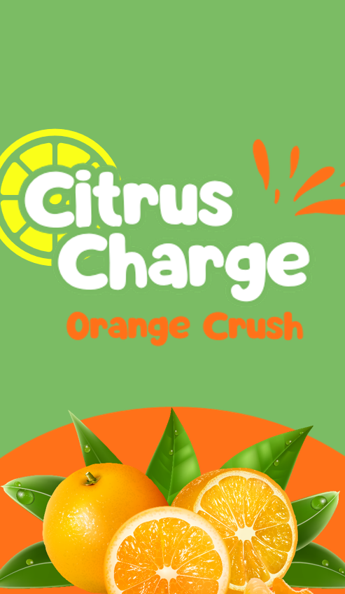
When I first thought of a healthy energy drink company, I thought of pastel colours paired with realistic and minimalistic visuals. So, while I was doing my contextual and competitive research, I created mock up designs so I could see my vision clearly. I was set on the idea as it was what I thought fit the company type the most. However when I started my competitor research I noticed that all of the healthy energy drink companies had the same visuals and appealed to people who enjoy the new basic minimal design of the 2020s. seeing the same idea be remade over and over made me realise that my project would just be another recycled idea that has been done countless times and the project wouldn’t stand out. This motivated me to find a newer unique idea that is not like the competitors. I’ve always had interest in 2000s pop culture, and I enjoy nostalgic things so that is when my mind clicked to doing a company based around the 2000s. However, when looking into the energy rinks at that time they were incredibly unhealthy and by portraying a healthy brand in that way would confuse consumers as it had the visual pf an unhealthy drink, but it was healthy. This led me to making the drink Frutiger aero inspired. I only recently found out about that aesthetic from TikTok and posts about it were very popular and the comments would discuss how much the miss those types of design. I went on multiple pages on Frutiger aero afterwards to understand what the aesthetic was and what factors make something Frutiger aero. After looking at multiple pages of media I decided that is what I would basing my project on. Below are the original concept images for citrus charge.


Comments